Standard Chartered · 2019
Databox
Data visualisation · Dashboard · Banking
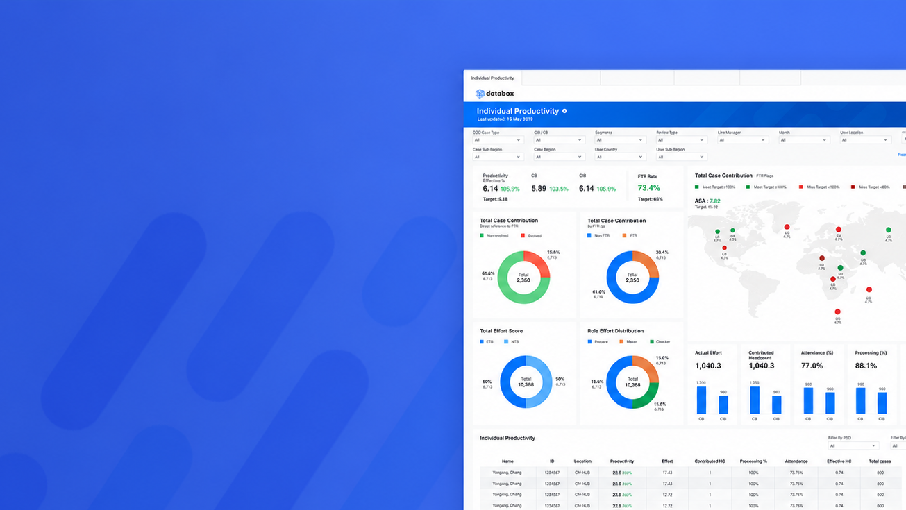
An end-to-end redesign of a data analytics platform for the bank’s middle office.
Context
A data analytics platform used daily by middle-office teams to monitor and interrogate large data sets.
What I did
- Conduct user research
- Explore concept design for validation
- Low-to-mid fidelity wireframing and UI design
- Design thinking workshop facilitation
- Stakeholder engagement and alignment
The platform
Inform and inspire with data.
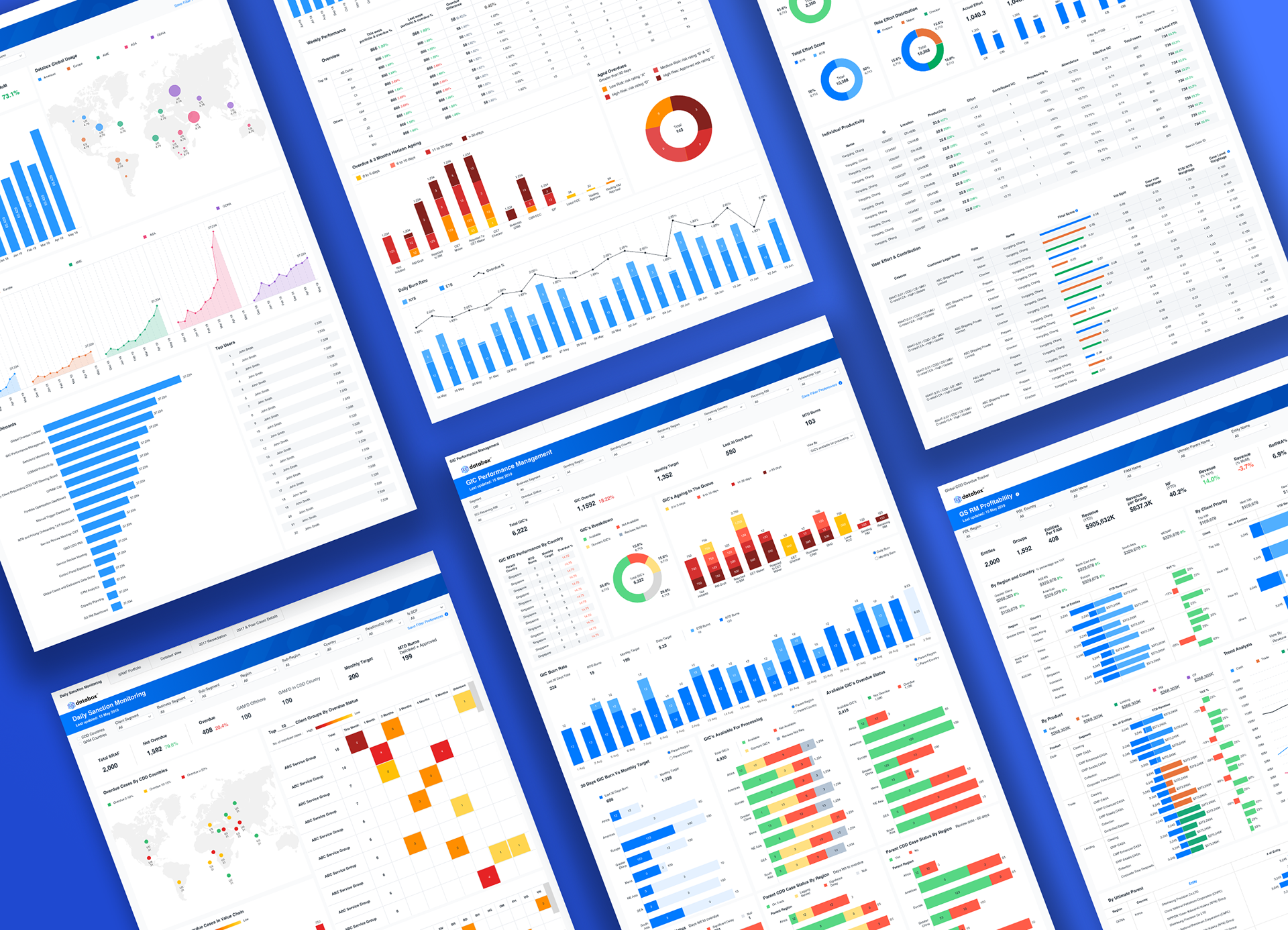
Databox is a data analytics platform built with Tableau software, used internally by the bank to provide data-driven insights to teams and business units tracking subjects like productivity, overdue status and revenues.
Since it first launched, Databox has grown exponentially — with over 2,000 unique users across business units and over 200,000 views per month, it is the most used Tableau site in the bank.
The process
Design thinking, end to end.
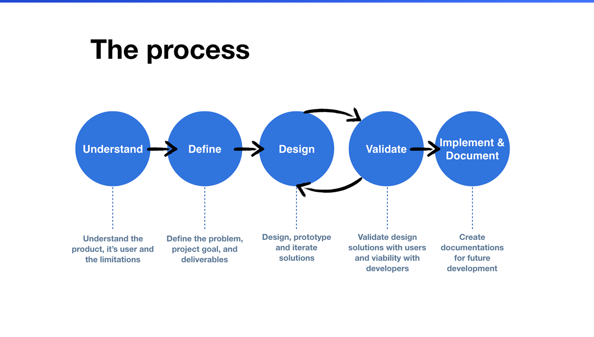
The redesign followed a five-step process — understand, define, design, validate, and implement & document — with design and validation iterating in a loop until the solution held up with both users and developers.
Project goals
Standardise, humanise, scale.
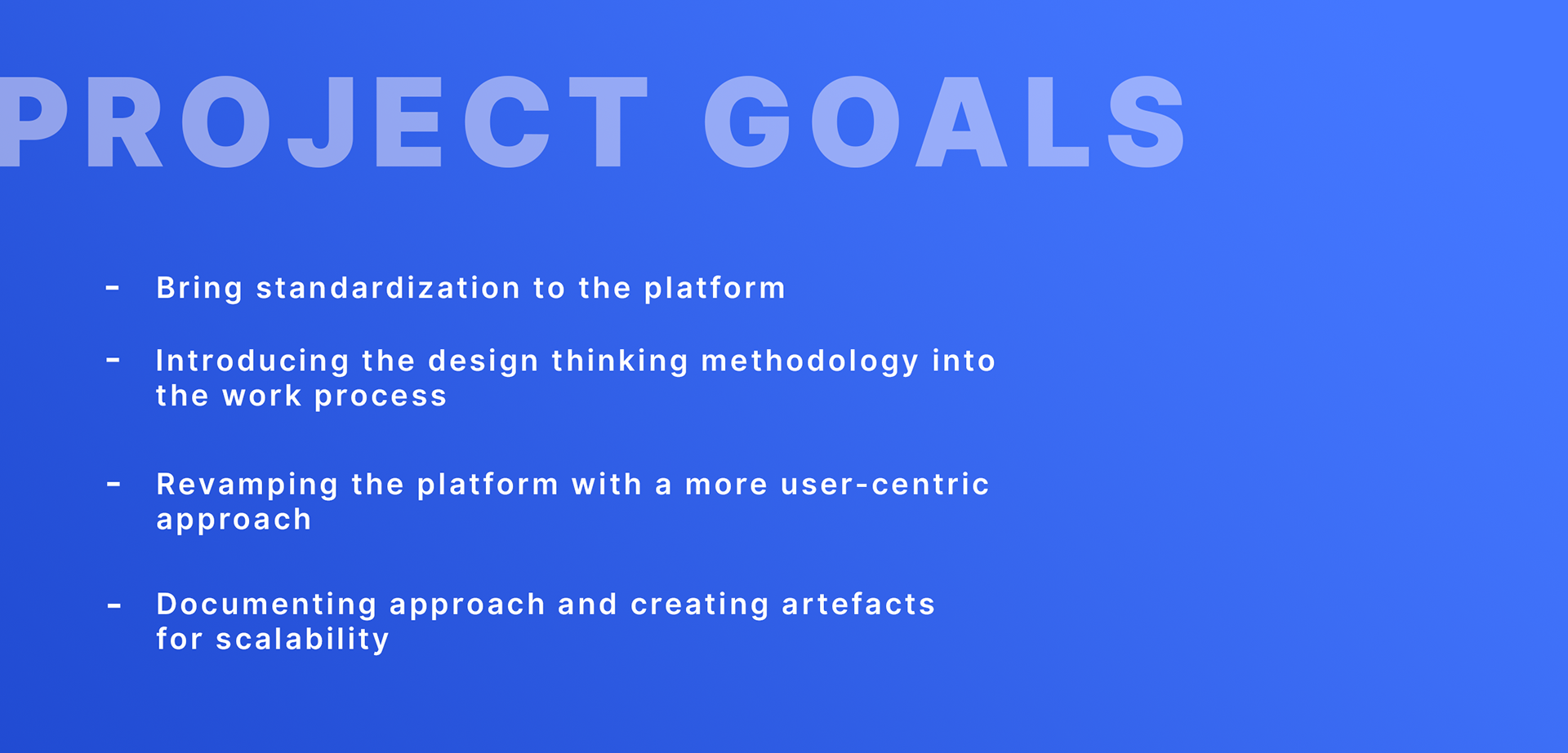
- Bring standardization to the platform.
- Introduce the design thinking methodology into the work process.
- Revamp the platform with a more user-centric approach.
- Document the approach and create artefacts for scalability.
Understanding the users
Three audiences, three sets of frustrations.
Interviews with dashboard owners, dashboard creators and end users surfaced very different pain points — from unclear access requests and design-by-committee clutter, to slow load times, missing metrics and doubts about data accuracy. Mapping these side by side made it clear the platform needed structure, not just styling.
Dashboard owners
Someone from the business unit who engages the Databox team to create a dashboard.
- How do people request access to the dashboard?
- I am not sure what is the status of the changes which I have asked for.
Dashboard creators
The analyst from the team who was assigned to develop this dashboard.
- “The business team told me to change it to this colour because they prefer it this way.”
- “I was told to design it this way.”
- “The dashboard wasn’t this cluttered when we first built it, but we were told to add more charts.”
End users
Team members who use this dashboard for their daily work.
- “It loads way too slow.”
- “How do you download the data from the dashboard?”
- “Dashboard is not updated frequently enough.”
- “How accurate are the data?”
- “How is this metric being calculated and who shall I ask?”
- “X information is missing, so I am calculating it in Excel sheets.”
The starting point
What the platform looked like.
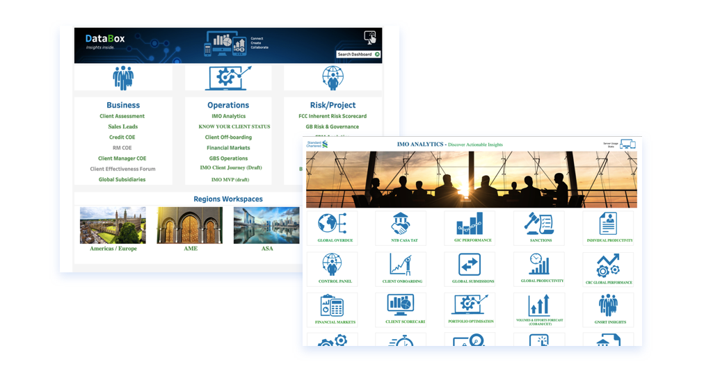
The existing entry points grouped dashboards under broad categories like Business, Operations and Risk, with separate workspaces for each region — functional, but dense, inconsistent and increasingly hard to navigate as the number of dashboards grew.
Information architecture
Sorting out the structure.
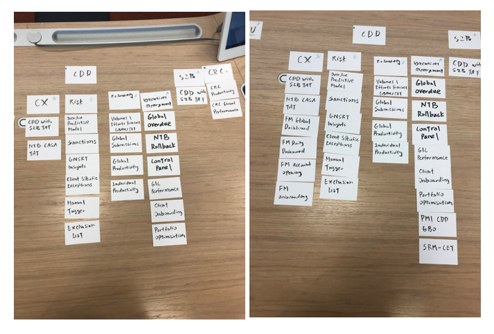
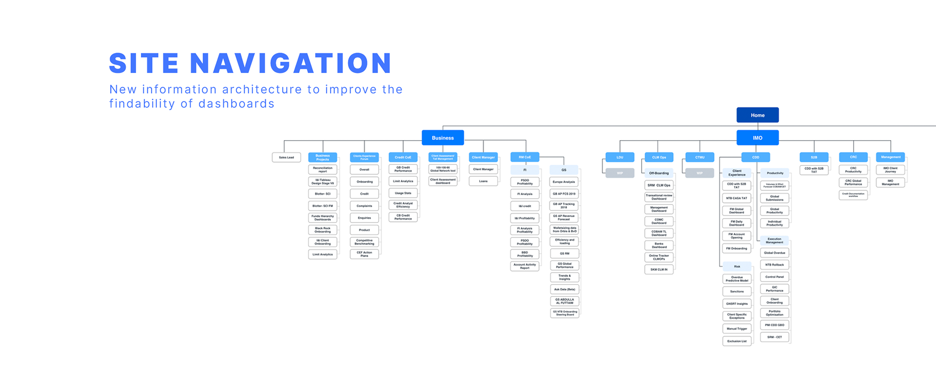
Card sorting sessions helped reorganise the platform's growing collection of dashboards into groupings that matched how people actually looked for them. The result was a new site navigation that improves the findability of dashboards across the Business and IMO sides of the platform.
Design iterations
Exploring the home experience.
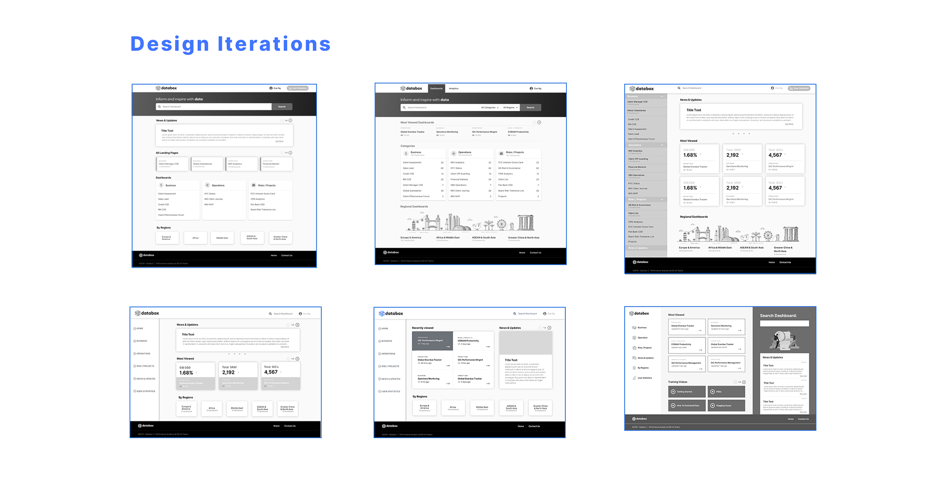
The home page went through several rounds of iteration — testing different navigation models, dashboard groupings and ways to surface the most viewed and recently used content — before landing on a structure that balanced findability with a clear visual hierarchy.
Design language
A system built for data.
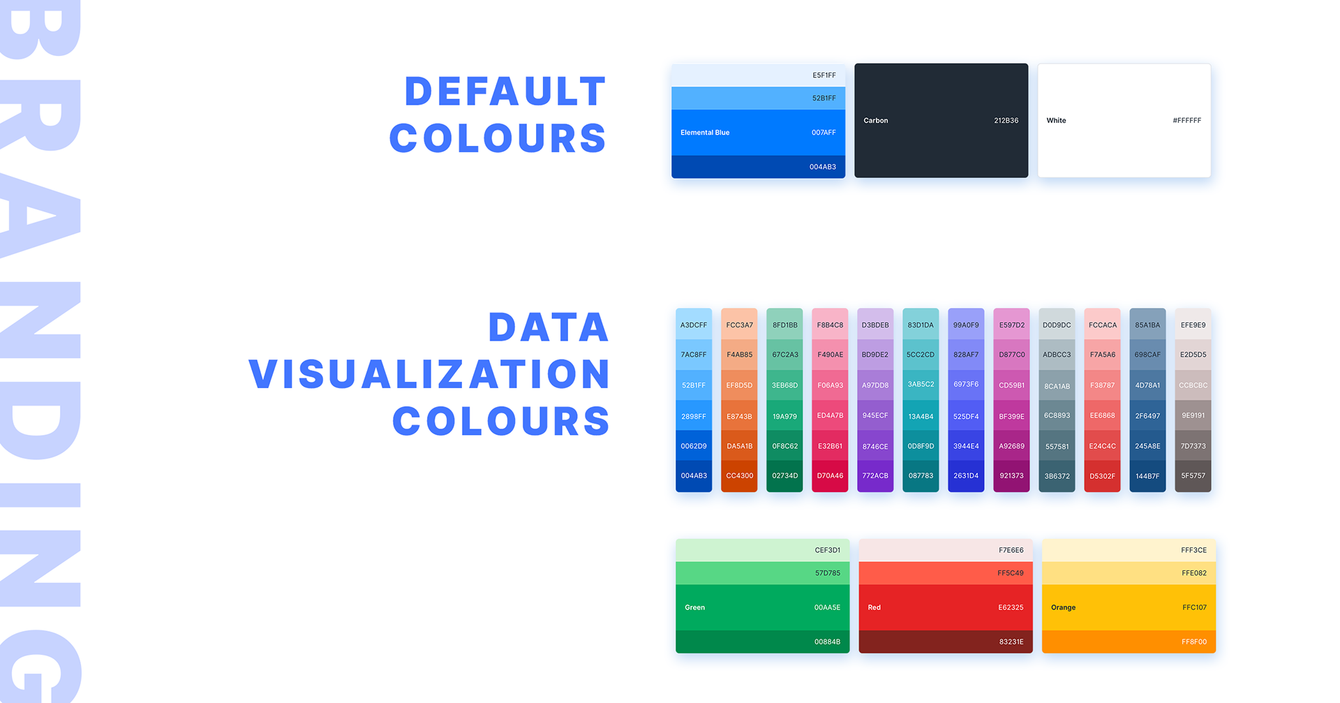
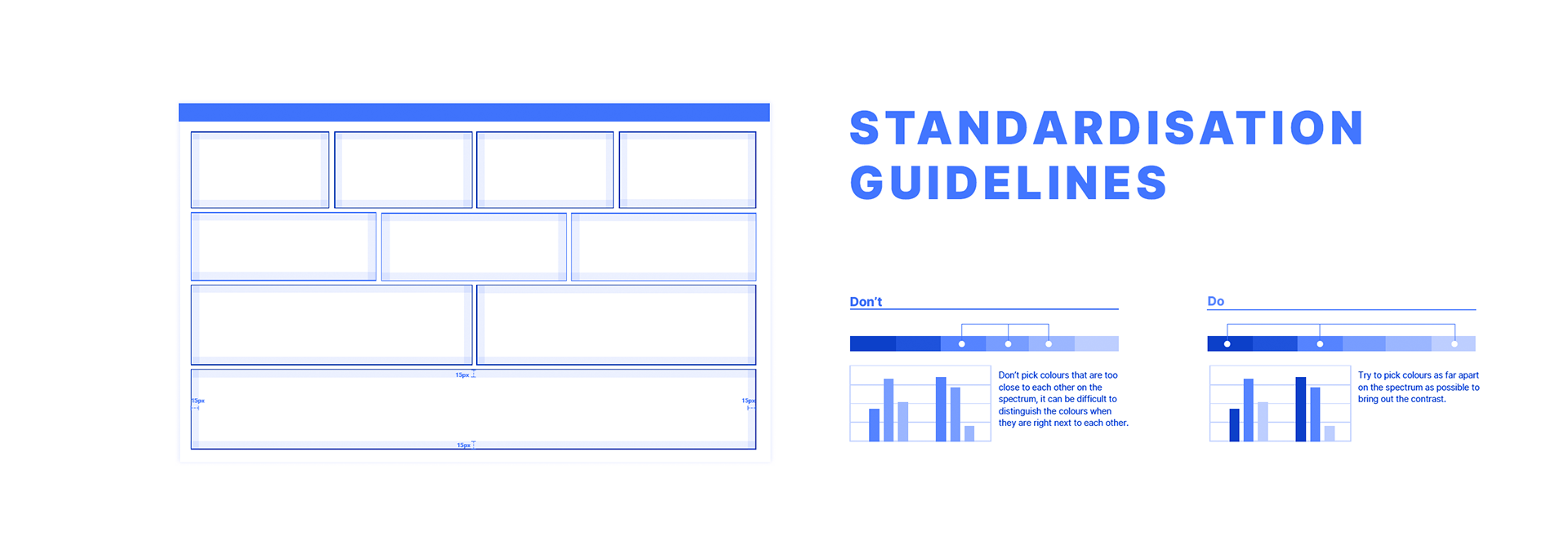
A refreshed identity and a documented colour system gave every dashboard a shared foundation — default colours for interface elements, an extended palette for data visualisation, and clear guidance on picking colours with enough contrast to read at a glance.
The redesign
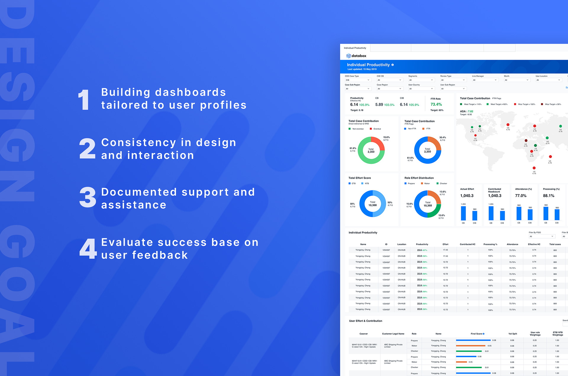
Four principles, one platform.
- Building dashboards tailored to user profiles.
- Consistency in design and interaction.
- Documented support and assistance.
- Evaluating success based on user feedback.
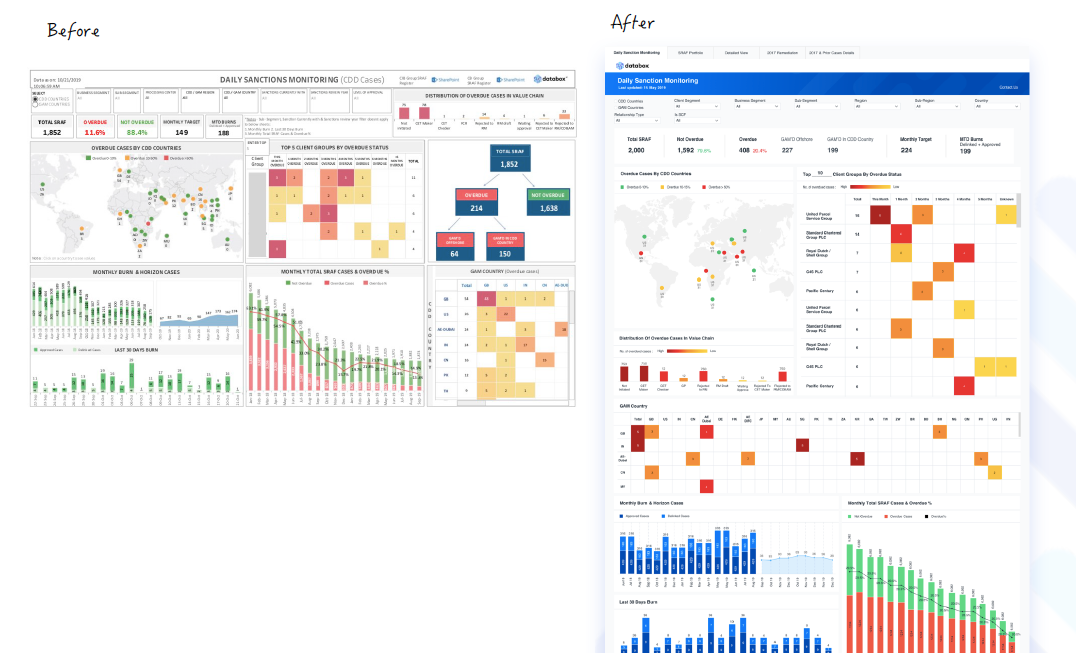
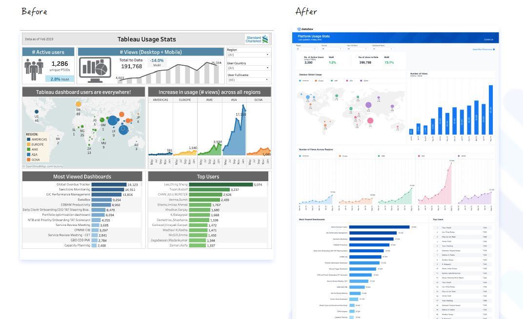
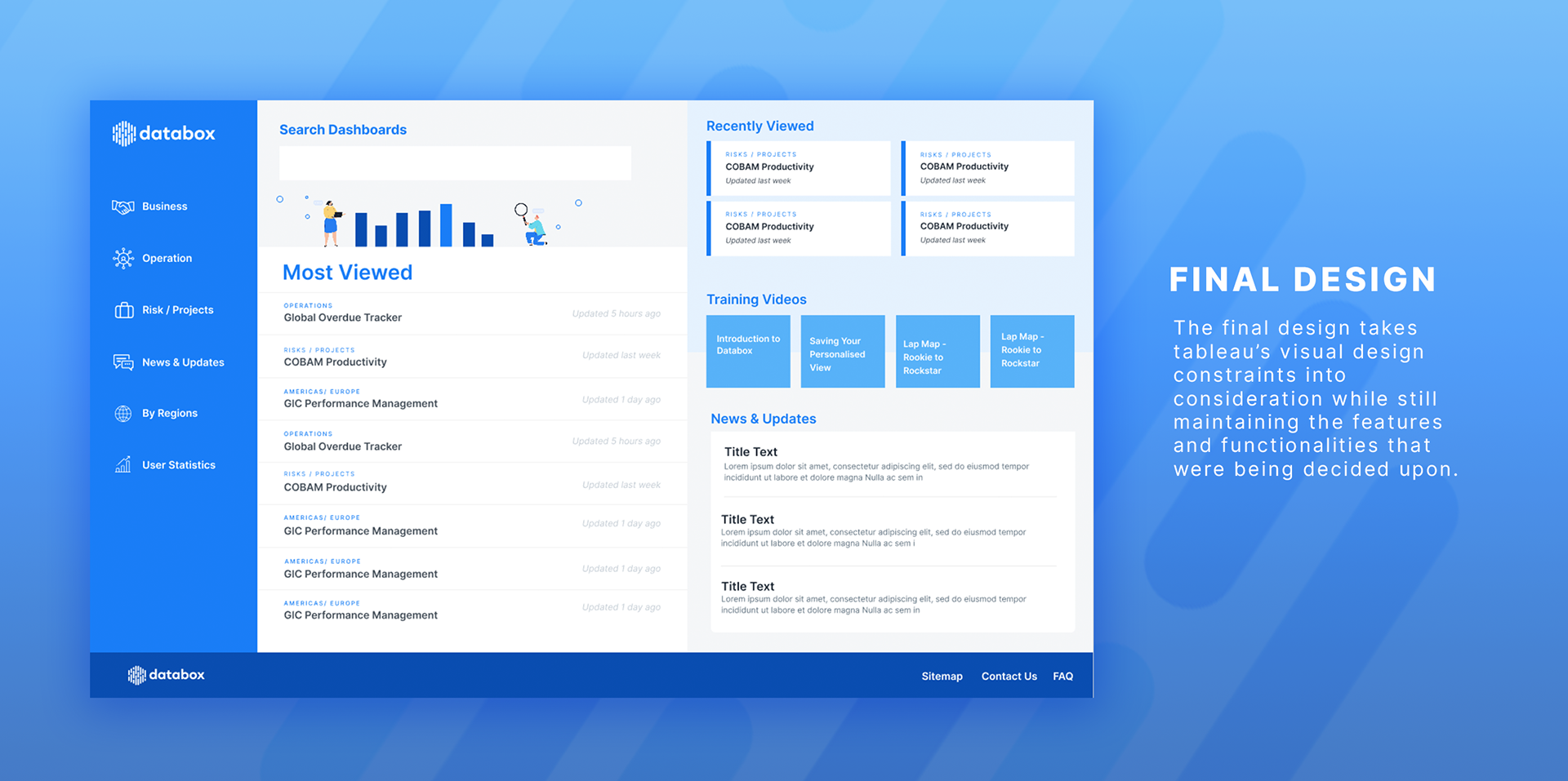
Final design
Designed within Tableau's constraints.
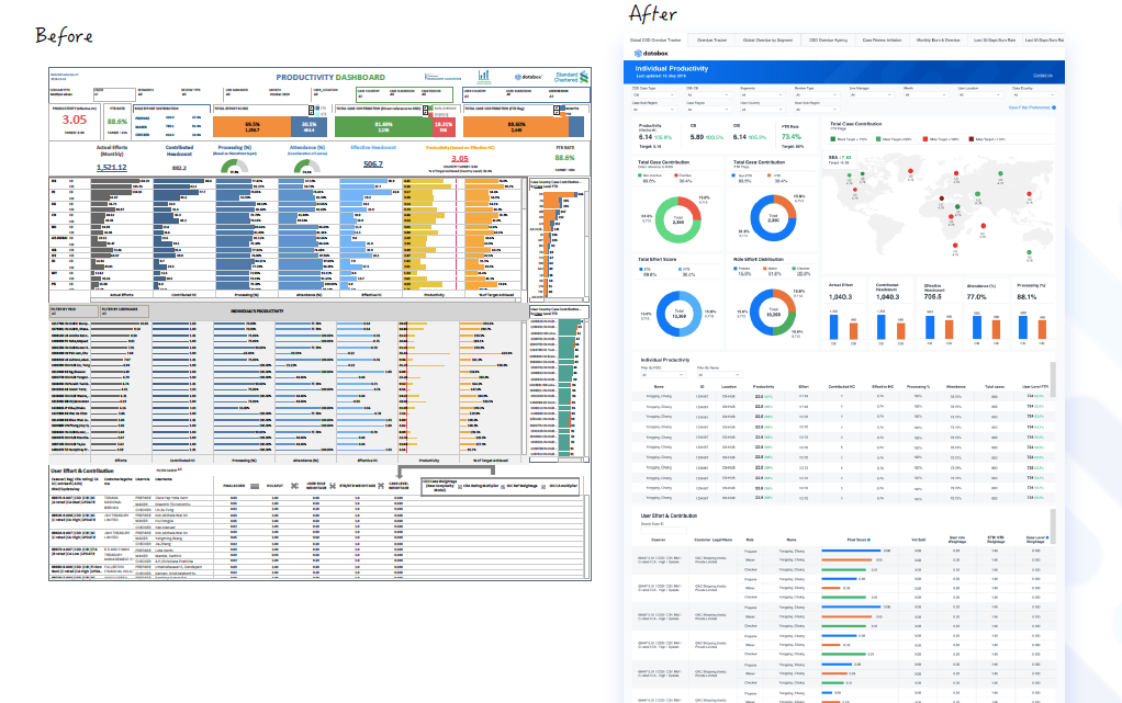
The final design takes Tableau's visual design constraints into consideration while still maintaining the features and functionalities that were decided upon — a home experience with search, most viewed and recently viewed dashboards, training videos, and news all within one consistent system.