Branding

Project 01 · Brand identity · Visual system

T8

A flexible identity shaped by the force and transformation of a typhoon.

The idea

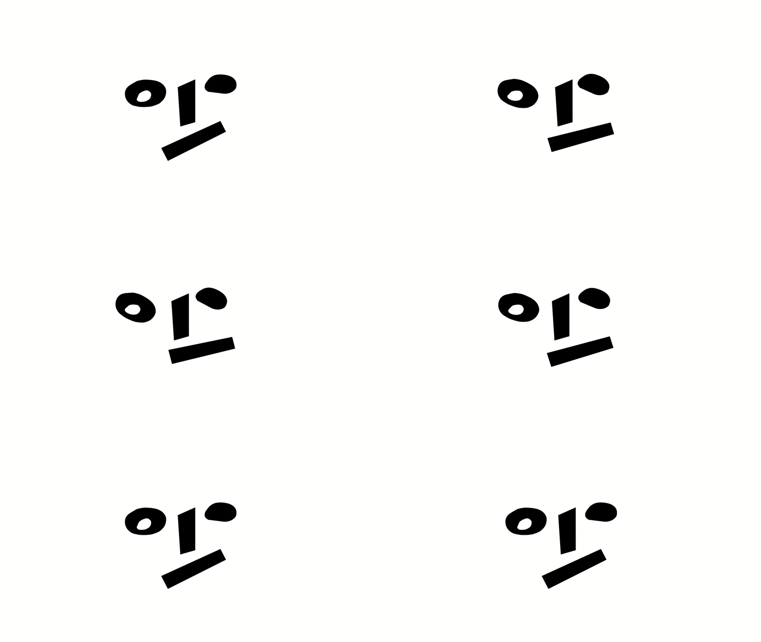
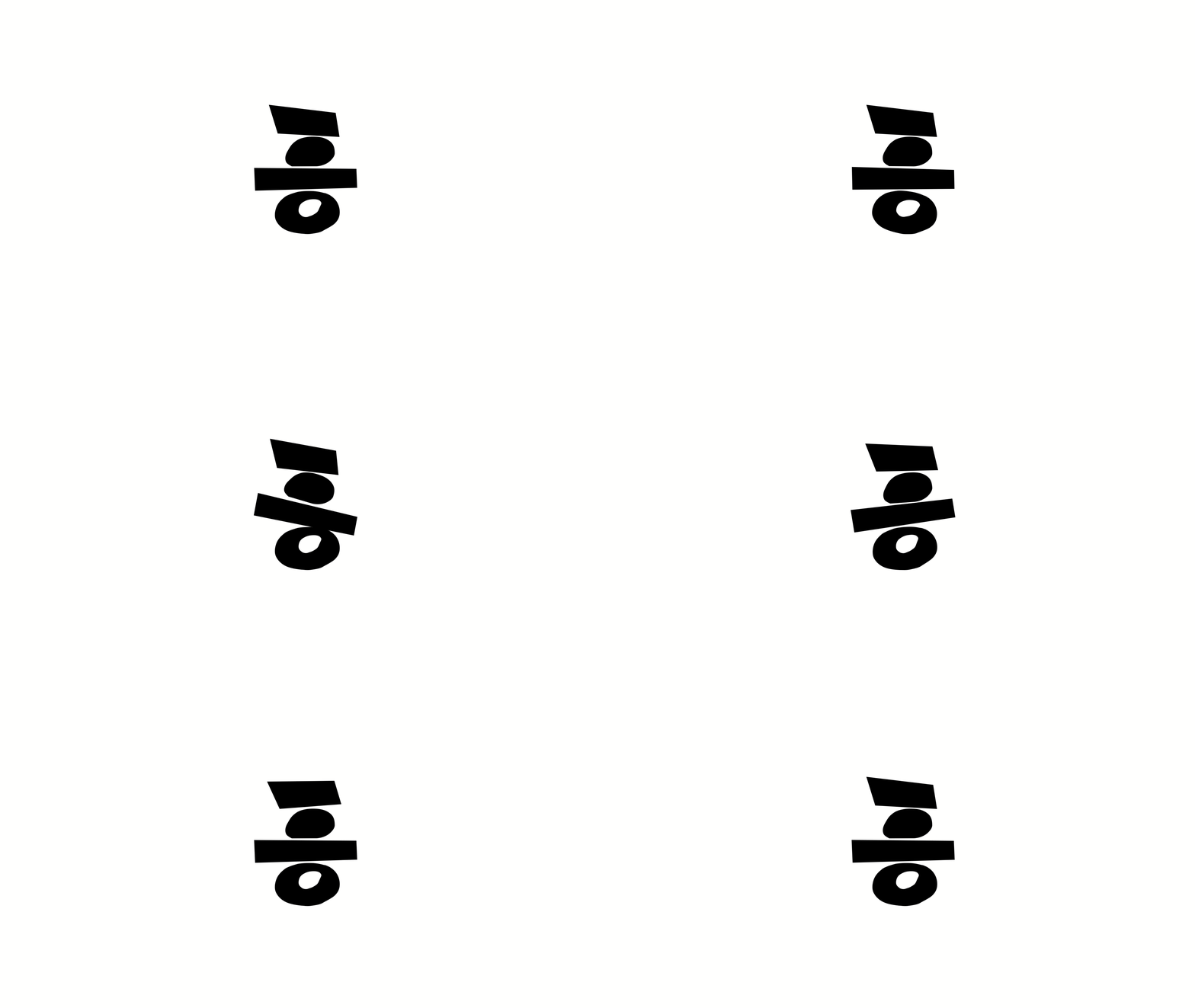
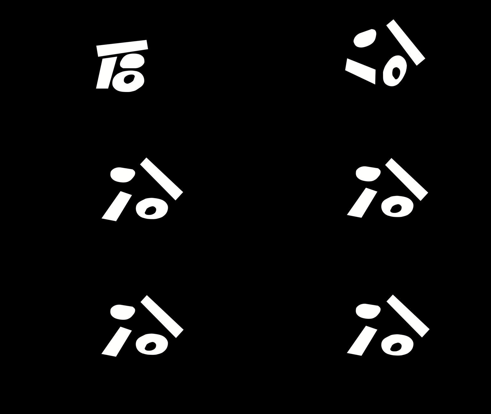
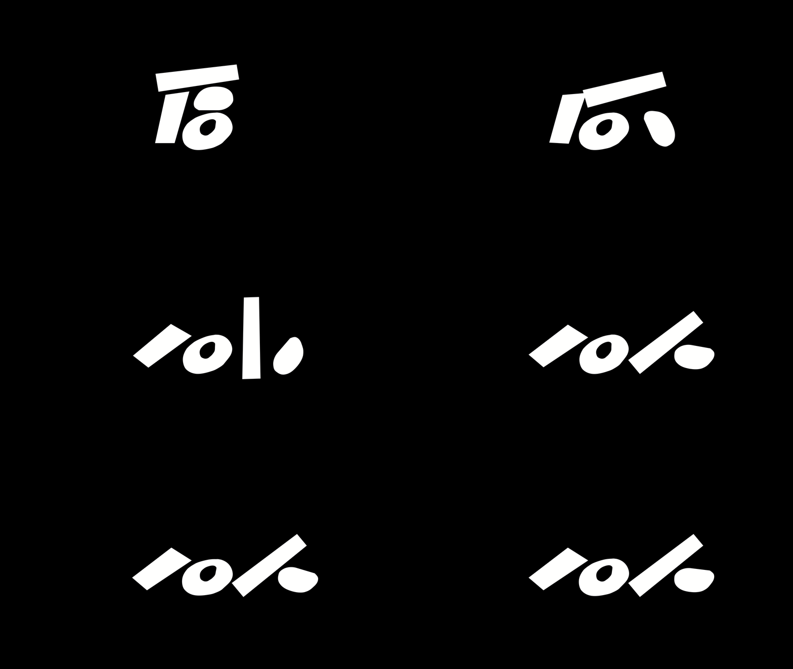
The mark is built from four geometric elements that can be deconstructed into new patterns and reconstructed into its original form—expressing resilience, creativity and transformation.
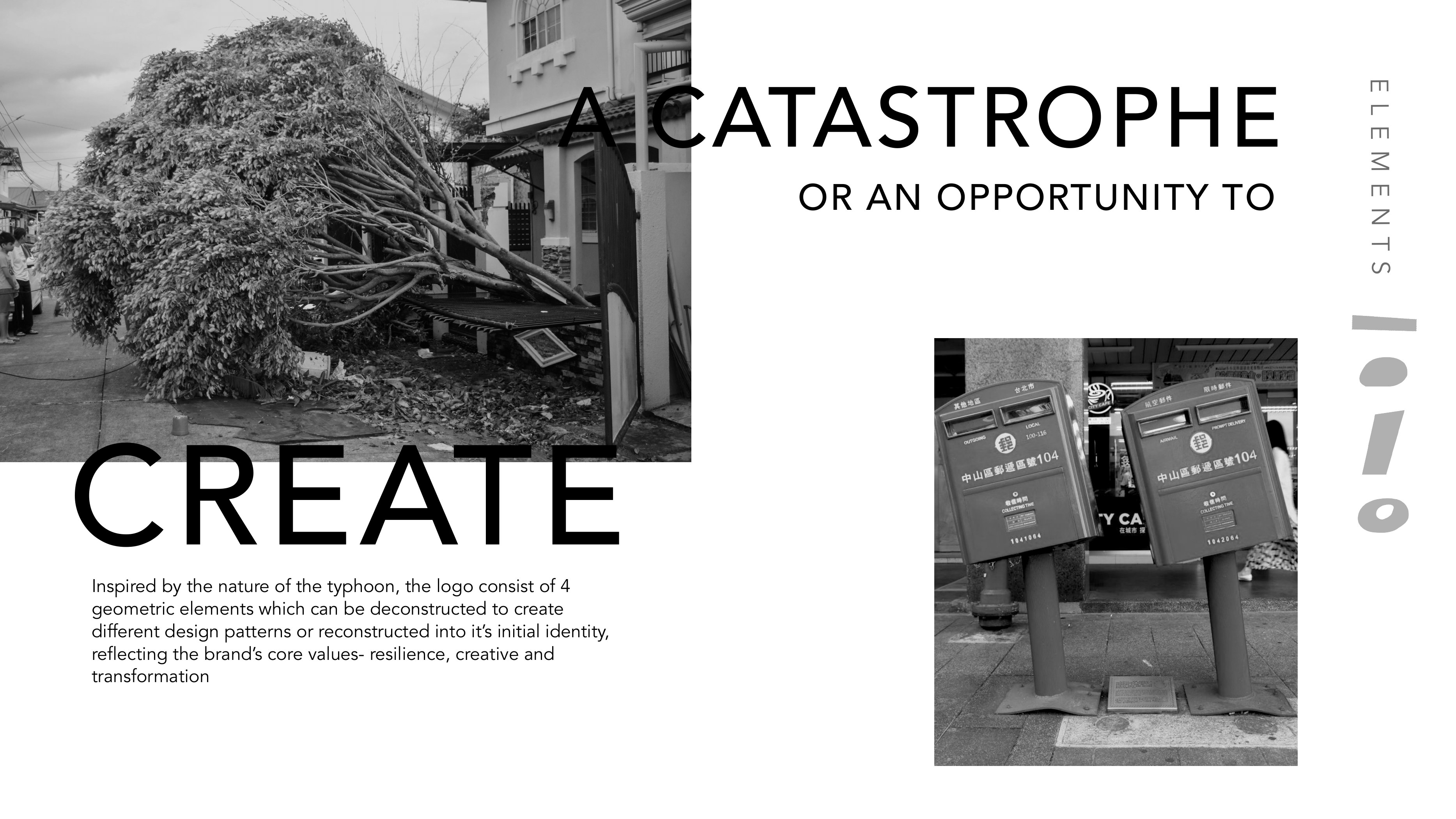
T8 identity concept inspired by typhoon imagery
Concept01
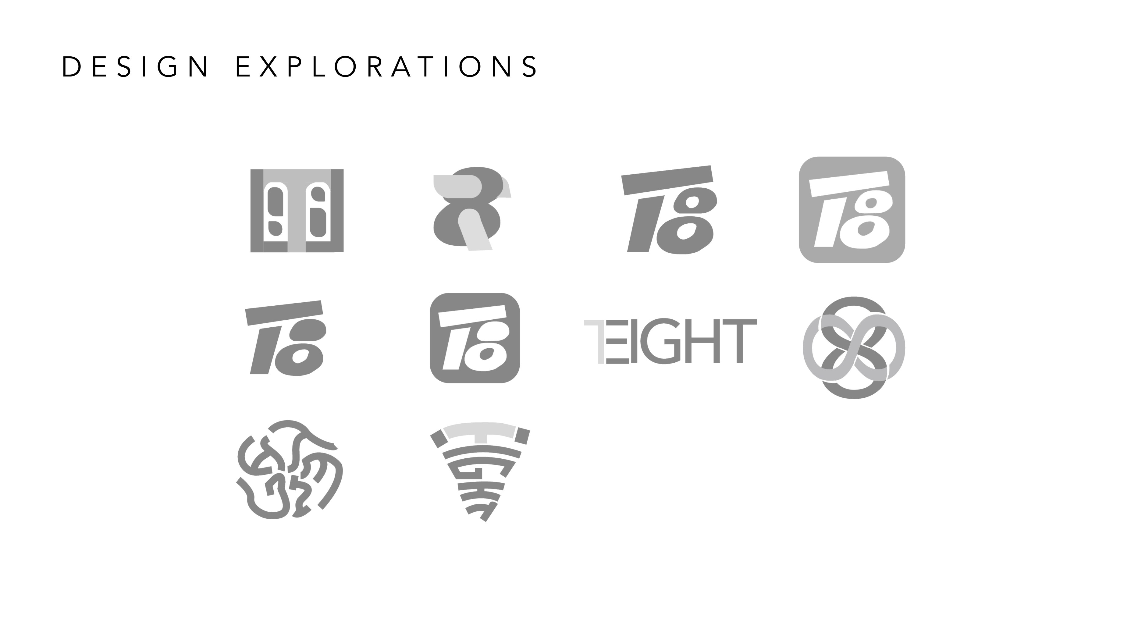
A series of early T8 logo explorations
Design explorations02
Animated T8 identity elements moving into view
Motion exploration 0103
Animated T8 geometric identity elements in motion
Motion exploration 0204
Animated T8 identity elements forming a vertical composition
Motion exploration 0305
Animated white T8 symbol assembling on a black background
Motion exploration 0406
Animated white T8 symbol transforming on a black background
Motion exploration 0507
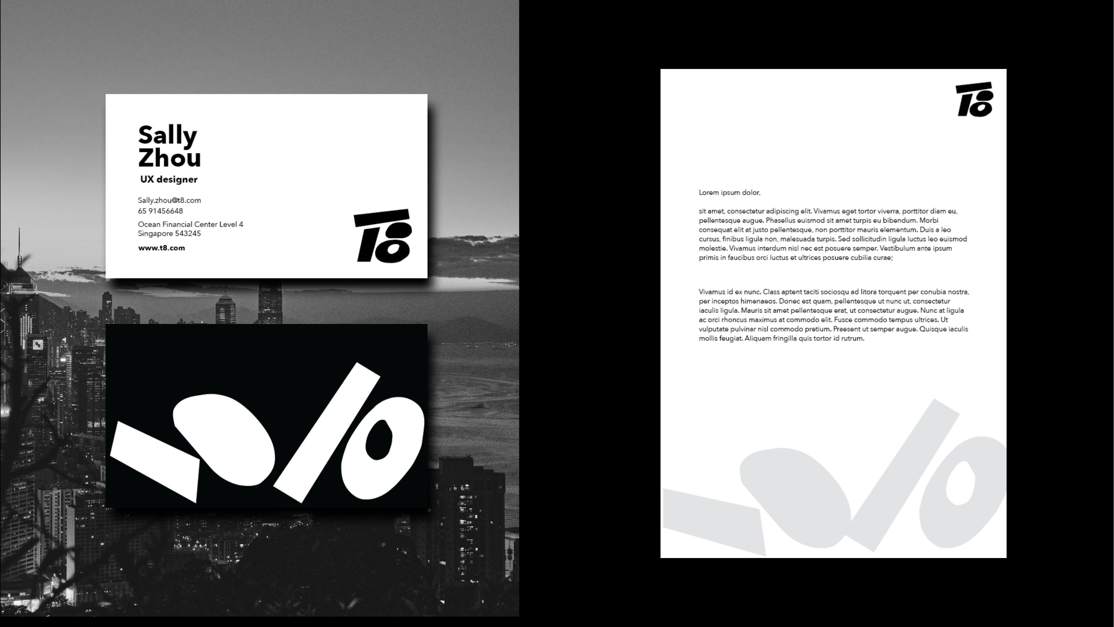
T8 logo applied to stationery and business cards
Identity applications08
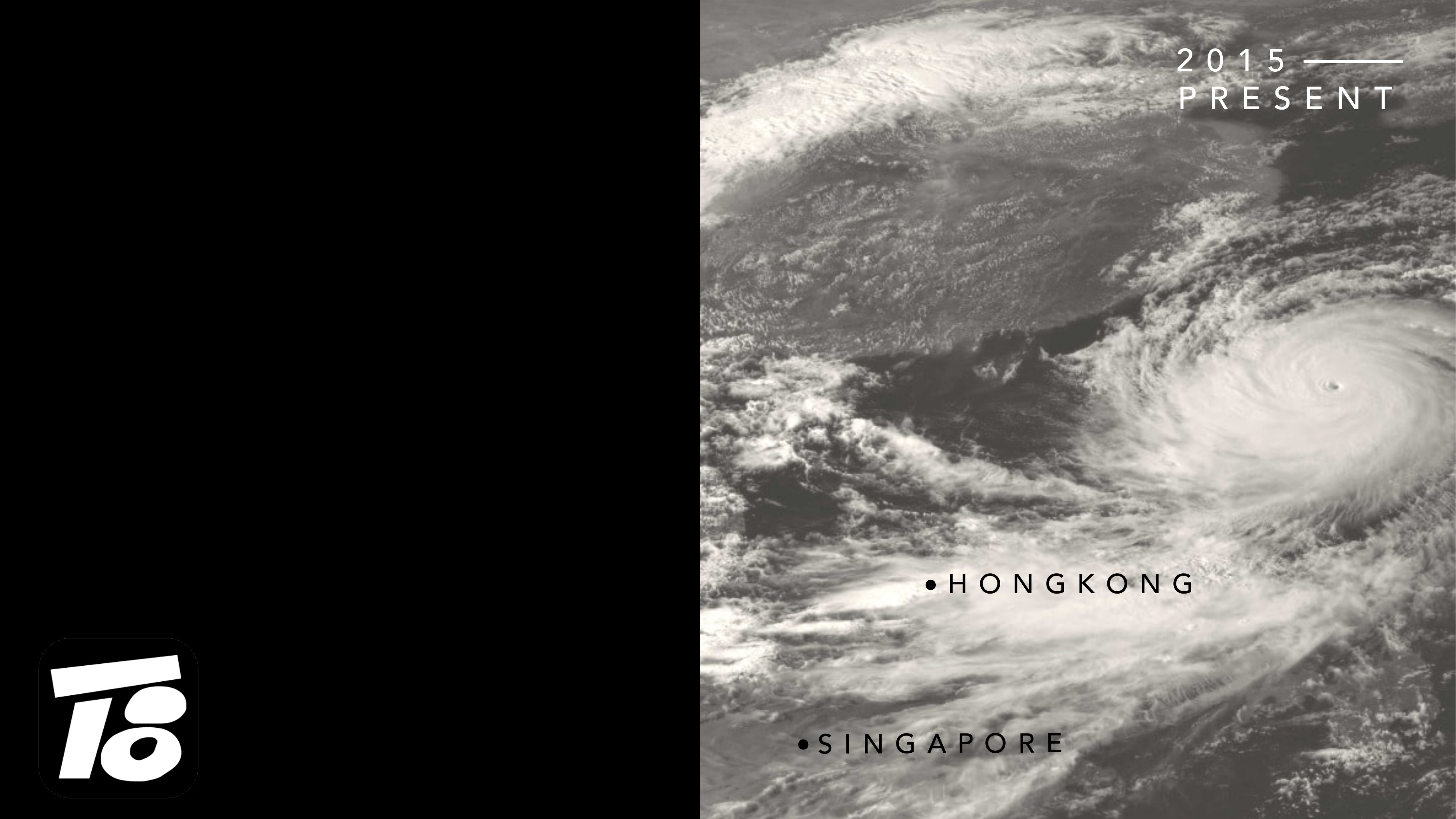
T8 identity alongside typhoon imagery and Hong Kong and Singapore locations
Brand overview09

Next identity

Agent/Phi